Reading Comfort Settings for Dyslexic Spellers: What Fonts, Overlays, Spacing & Calm Mode Actually Do
OpenDyslexic font, colored overlays, extra letter spacing, reduced motion — these settings show up in nearly every "dyslexia-friendly" app, but the evidence behind each one is different, and none of them are a substitute for teaching. Here's what actually helps, what's still debated, and how to find the combination that works for your child.
Most advice on dyslexia and spelling focuses on how a child is taught — multisensory instruction, explicit phonics, mnemonics. That advice matters. But there's a second, quieter question that gets far less attention: what does it physically feel like for a dyslexic child to look at the screen or page they're asked to read from?
Many dyslexic children describe letters that seem to "swim," crowd together, or blur at the edges — a phenomenon often called visual stress. It's separate from the phonological processing difficulties at the core of dyslexia, but it can stack on top of them, making an already hard task physically uncomfortable. Reading comfort settings — font choice, color overlays, letter spacing, and motion reduction — target this layer specifically. They don't teach spelling. They change how tiring or distressing it is to look at the words in the first place.
This post goes through each setting on its own, honestly — including where the research is solid, where it's mixed, and where it's mostly anecdotal — so you can make an informed choice instead of assuming every "dyslexia mode" toggle is equally proven.
OpenDyslexic and Similar Fonts: Comfort, Not Proven Reading Gains
OpenDyslexic is a free typeface designed with heavier letter bottoms and exaggerated distinguishing features — the idea being that weighting the base of each letter reduces the chance of a child perceiving it upside-down or flipped (like confusing "b" and "d").
What the research actually shows:
Controlled studies on OpenDyslexic specifically — including a widely cited 2018 study by Kuster and colleagues — have not found a statistically significant reading-speed or accuracy advantage for dyslexic readers compared to standard fonts like Arial or Times New Roman. Letter reversal confusion in dyslexia is a language-processing issue, not primarily a visual-shape issue, so a heavier letter bottom doesn't address the underlying mechanism the way it was designed to.
That doesn't mean the font is useless. Many dyslexic readers and their parents report it's simply more comfortable to look at, and subjective comfort has real value even without a measurable speed gain — a child who feels less visually fatigued may sustain attention longer and approach practice with less dread.
The honest framing: treat a dyslexia-friendly font as a comfort preference to try, not a proven intervention. Some children genuinely prefer it and read more willingly with it on. Others notice no difference, or occasionally prefer a plain sans-serif font like standard system fonts instead. The only way to know is to let your child compare and choose.
Letter & Word Spacing: The Strongest Evidence of the Four
Of all the reading-comfort settings covered here, extra letter spacing has the most direct experimental support.
What the research actually shows:
A frequently cited 2012 study by Zorzi and colleagues, published in PNAS, found that increasing the spacing between letters measurably improved reading speed in dyslexic children — without any explicit training — and the effect was larger than the benefit of increased font size alone. The proposed mechanism is crowding: letters positioned close together interfere with each other during visual processing, and dyslexic readers appear to be disproportionately affected by this crowding effect compared to typical readers.
Follow-up studies have found similar, if smaller, effects — spacing doesn't "fix" dyslexia, but of the common accessibility toggles, it has the clearest, most-replicated evidence trail.
In practice, this means widening the gaps between letters and words — not adding more space than needed, which can itself hurt readability, but enough to reduce visual crowding. It's a small, low-risk change that's worth turning on by default rather than treating as optional.
Colored Overlays: Real for Some Children, Not Diagnostic
Tinted overlays and colored backgrounds trace back to work on what's often called Irlen Syndrome or Meares-Irlen syndrome — a proposed visual stress condition where certain readers experience glare, pattern distortion, or discomfort from high-contrast black-on-white text, and report relief from specific colored filters.
What the research actually shows:
Irlen Syndrome itself is not a formally recognized medical diagnosis, and the broader research on colored overlays is genuinely mixed. Some controlled studies find a subset of readers — with or without dyslexia — report less visual discomfort and read somewhat faster with an individually matched color. Other reviews find effects that don't hold up once expectation and placebo response are controlled for. There is no reliable evidence that overlays improve the underlying phonological processing that defines dyslexia.
Two things can be true at once: overlays are not a validated dyslexia treatment, and a specific child can still find a specific tint genuinely more comfortable to read from. The individual variation is the whole point — which is why overlay color has to be a preference a child sets for themselves, not a rule applied to every dyslexic reader.
If you try overlays, offer 2–3 options (commonly cream, pale blue, or pale green) and let your child compare directly rather than assuming one is objectively better. If they show no preference, that's a valid and common outcome — skip it and move on to settings with more consistent impact.
Reduced Motion & Calm Mode: Protecting Limited Attention
This one is less about vision and more about cognitive load. Spelling already demands significant working memory from a dyslexic child — holding a letter sequence in mind while writing it out is effortful even before anything on screen moves. Confetti bursts, pulsing error highlights, and animated transitions compete for the same limited attention that's needed for the spelling task itself.
Why this matters more for some children
Attention and working-memory limitations are common alongside dyslexia — dyslexia and ADHD co-occur at rates well above chance. For a child managing both, peripheral motion isn't just distracting in a general sense; it actively drains the same cognitive resource pool the spelling attempt needs.
Reduced motion is also directly relevant to vestibular sensitivity and general sensory processing differences, which is why most operating systems now ship a system-level "Reduce Motion" setting — good software should respect it automatically, not just offer its own separate toggle.
A well-designed calm mode doesn't remove feedback — a child still needs to see that a letter was wrong — it just removes the movement and celebration animation layered on top of that feedback. Correct is still shown as correct; it's just not accompanied by a burst of confetti competing for attention mid-task.
How to Actually Find What Helps Your Child
Because the evidence is strongest for spacing and weakest — but still individually meaningful — for font and overlay color, the right approach isn't to turn everything on at once and assume it's working. A short, deliberate trial tells you more:
Turn on spacing first, alone
It has the best evidence and the lowest chance of making anything worse. Leave it on as a baseline while you test everything else.
Change one variable at a time
Try the font for a few sessions before adding an overlay. If you change everything simultaneously and something helps (or hurts), you won't know which setting did it.
Ask your child directly, and believe the answer
"Does this feel easier to look at, or the same?" A dyslexic child is often the best judge of their own visual comfort, even if they can't articulate why.
Drop settings that show no benefit
More toggles is not automatically better. A setting that does nothing for your child is just visual noise — turn it back off.
How SpellCrush Implements Reading Comfort Settings
Because the right combination is different for every child, SpellCrush treats each setting as an independent, free, per-child toggle rather than one bundled "dyslexia mode." Turn on the one with strong evidence, try the rest, keep only what helps.
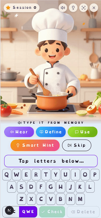
OpenDyslexic font toggle
Applies to the practice word, answer box, mistake reveal, and on-screen keyboard
None, cream, pale blue, or pale green overlay
Contrast-checked against every color used on screen, so legibility never drops
Extra letter & word spacing, larger text
Two separate toggles targeting visual crowding — the setting with the strongest research behind it
Calm Mode
Removes confetti and pulsing animation while keeping mistake feedback; also respects the device's Reduce Motion setting automatically
All four are free on every plan, set per child, and can be combined in any order — there's no requirement to enable all of them together.
What Reading Comfort Settings Don't Do
It's worth being direct about the limits here, because overclaiming accessibility settings does families a disservice:
They don't teach spelling rules or phonics
A more comfortable screen doesn't replace explicit instruction in sound-letter correspondence. Comfort settings remove friction; they don't deliver content.
They don't diagnose or confirm dyslexia
Whether a child prefers an overlay or a particular font says nothing definitive about whether they have dyslexia. Formal evaluation is a separate process.
They don't replace structured literacy instruction
A child who benefits from these settings still needs the multisensory, explicit teaching methods covered in our broader dyslexia spelling guide.
The Bottom Line
Reading comfort settings aren't one thing — they're four different interventions with four different levels of evidence, bundled together under a single marketing label because they tend to appeal to the same audience. Letter spacing has real, replicated research behind it. Fonts and colored overlays help some children meaningfully and do nothing for others, which is a legitimate outcome, not a failure of the tool. Reduced motion protects attention that spelling practice already asks a lot of.
None of them are a substitute for teaching. All of them can make the difference between a child who dreads looking at a spelling word and one who can sit with it long enough to learn it. Try each setting deliberately, keep what your child actually notices, and drop what doesn't move the needle.
Try All Four Reading Comfort Settings Free
OpenDyslexic font, tinted overlays, extra letter spacing, and Calm Mode are free on every SpellCrush plan, set individually per child. See the full built-for-dyslexia feature set, including audio-first practice and letter-level mistake highlighting.
Related Articles
Spelling Practice for Dyslexic Children: What Actually Works
Evidence-based multisensory strategies, accommodations, and tools for dyslexic learners.
How Visual Memory Aids Help Dyslexic Spellers
Why image-word pairing creates a second memory retrieval path for dyslexic spellers.
SpellCrush for Dyslexia
The full feature set built for kids who learn differently, in one place.


